

Website
View Website
HydroPeptide is a luxurious skincare brand, scientifically developed with patented peptide technology and epigenetic research to improve skin.
The Challenge
To improve the website’s visual experience to align it with HydroPeptide’s position as a premium and scientific skincare brand. The challenge was to make a complex skincare brand feel clear and approachable without losing the scientific edge that differentiates it from others on the market.
The website needed to serve two distinct audiences: experienced skincare customers who already understood active ingredients, and newer customers who needed help identifying the right products for their concerns. The goal was to simplify the user experience so new and old customers could make informed choices without difficulty before they purchase.
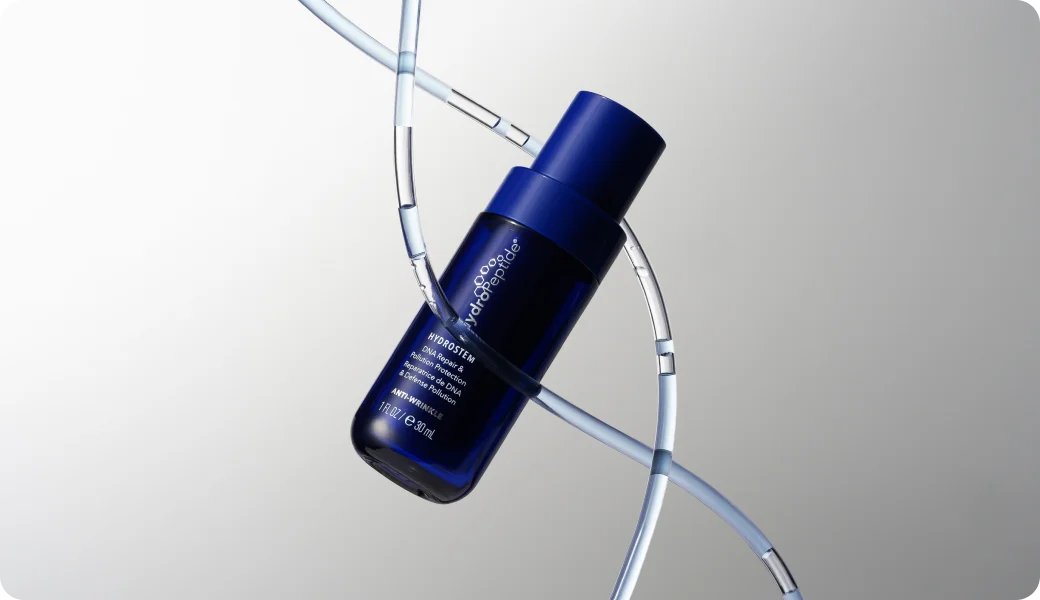
Familiarisation, Understanding and Research
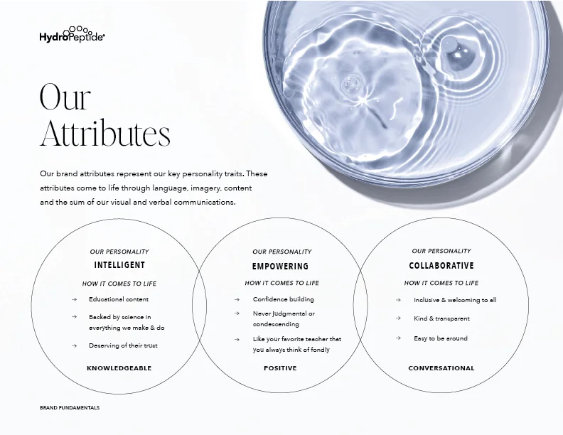
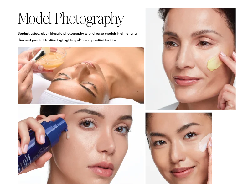
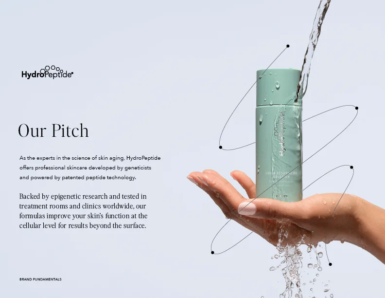
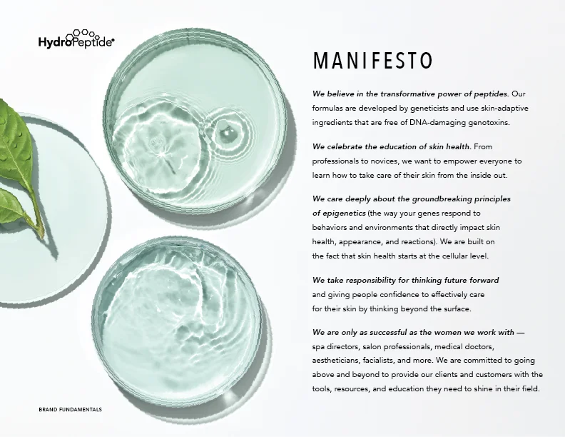
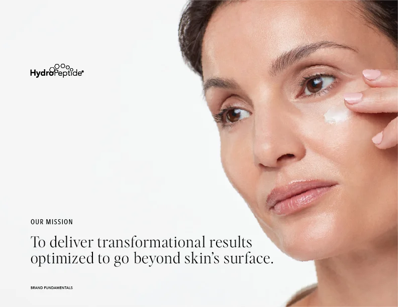
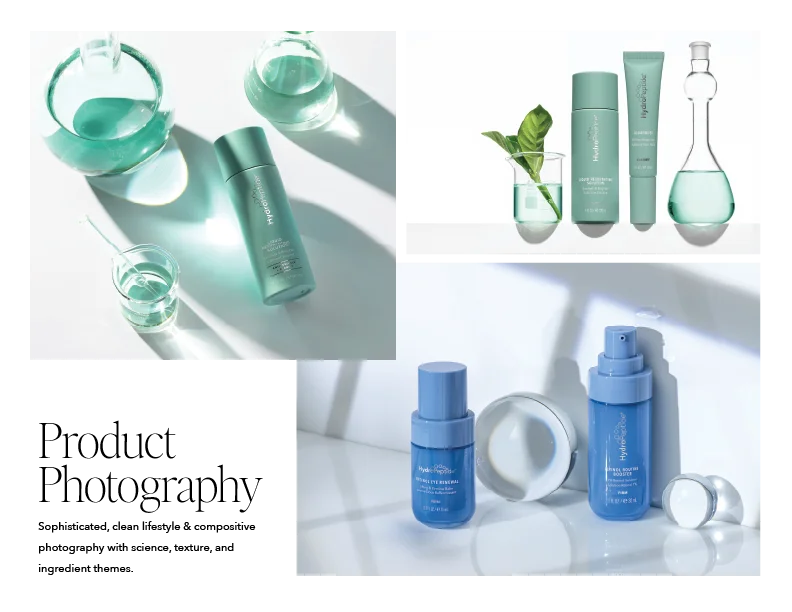
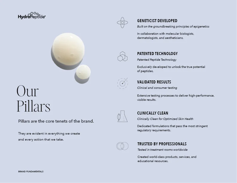
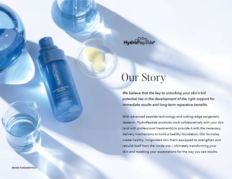
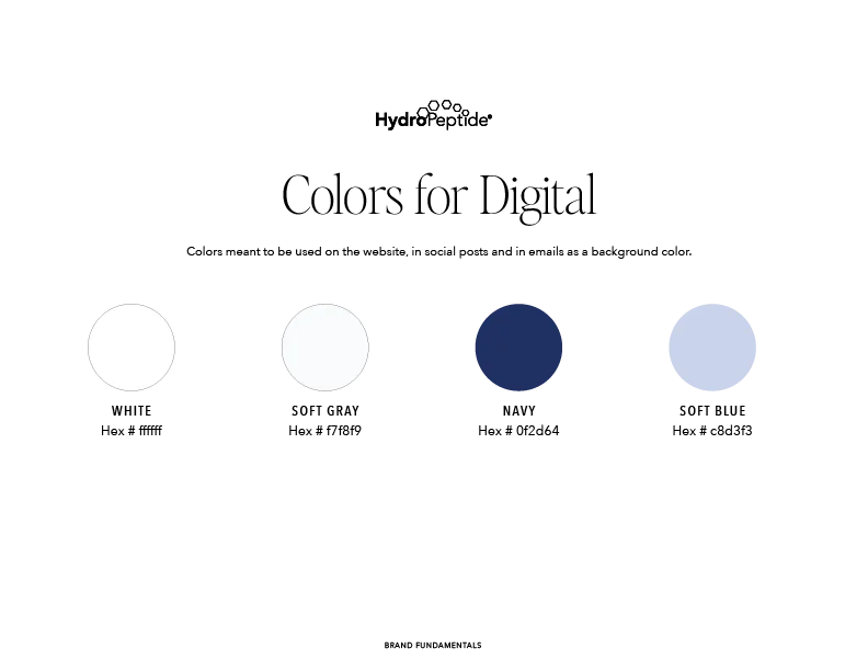
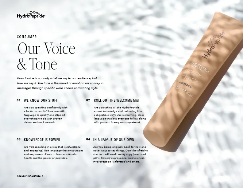
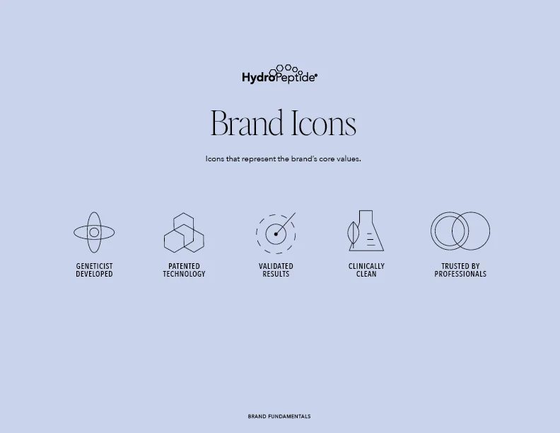
Before delving into a project of an established brand, it’s important to familiarise yourself with it and understand what it’s about — its USP, its look and feel, etc. I read the brand guide, their about page and story, went through their social media pages, read public reviews, and developed an outside user perspective of the overall brand before conducting more in-depth research from the inside looking out.
The research was collaborative across myself, the dev, management and marketing team. We came together for an initial brainstorming session to identify key issues with the current site and fresh ideas were brought to the table. A competitor analysis was conducted and information was compiled, Hotjar was installed on the old site to reveal user behaviours when using the site, I compiled a UX audit of what to improve, and we prioritised what was needed now and what could be added later.
Restructuring the Website’s Information Architecture
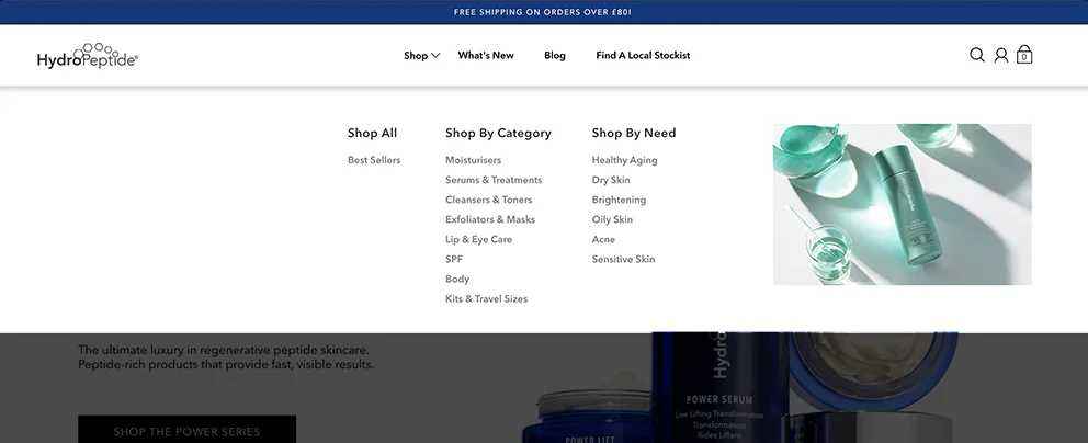
After the initial research, I think it’s important to take things to the foundation and see how everything interconnects on the website. Navigation is important. User experience for an e-commerce website is making it easy to use, find information and ultimately make a user feel confident in making a purchase. I reviewed the user feedback, performance, spoke to the marketing team and made a plan to make sure not only would the products be the main focus, but the information too because this is a unique selling point and wasn’t utilised enough on the previous version.
“Shop” as a mega-menu is fine as it’s a standard term that users are familiar with, but its dropdown menu was divided broadly into “Shop All”, “Category”, “Needs” and an image, so I knew we could create much more of an impact here. I replaced it with three clearer routes: “Product Type”, “Skin Concern” and “Collection”. I focused on the use of images to help give the user clarity and promoted the “Best Sellers”, and refined the hierarchy to make relevant products easier to find without overwhelming the user.
“What’s New” and “Blog” also felt broad and didn’t really give users much to go on, their click-rates were low and it felt like a gamble for users to click on, because you don’t really know what to expect when you click these terms. To solve this I combined them into a mega-menu called “Discover”, adding new informative pages such as “Our Story”, “Our Commitment” and “Our Science”, renamed “Blog” to “Articles”, and added a featured section linking collections and products to the discovery.
Homepage Redesign
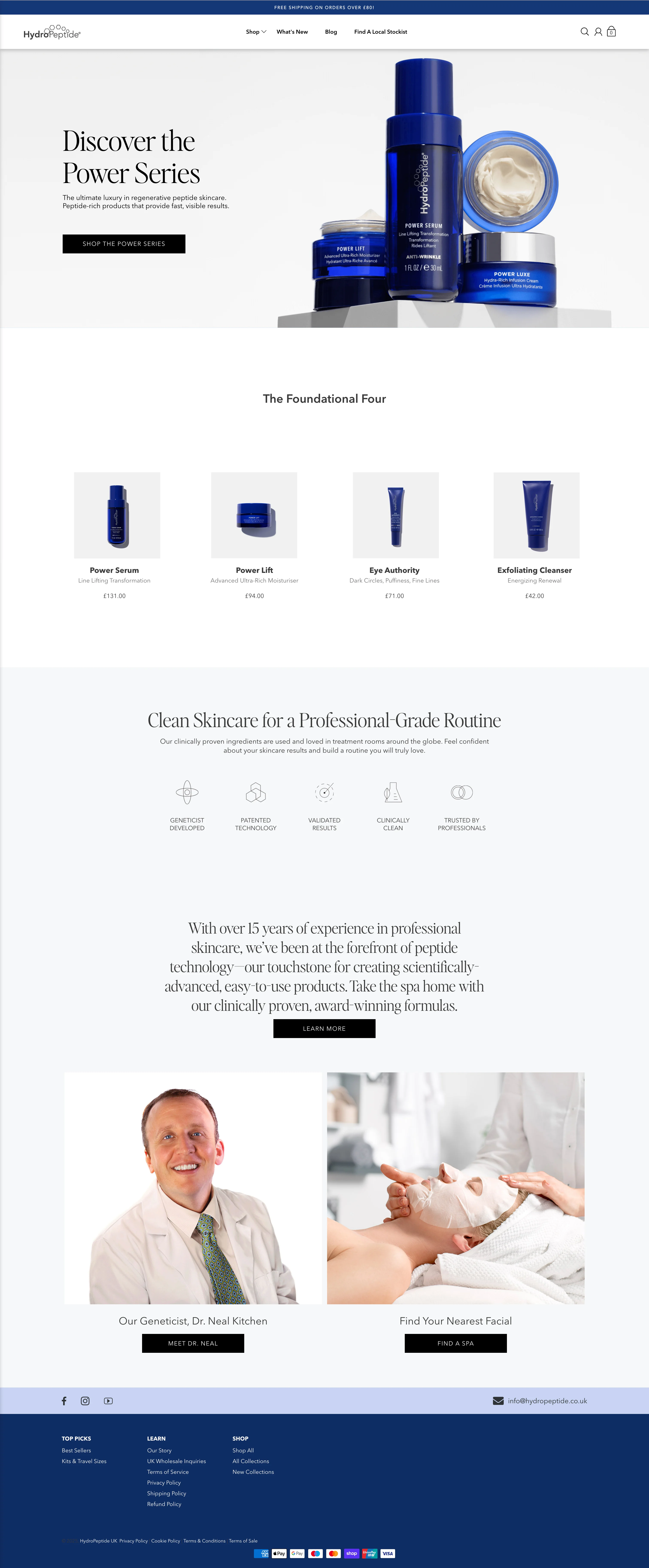
The original homepage relied heavily on promotional content and a small number of featured products, giving customers limited guidance beyond the initial campaign. I restructured the experience around product discovery, education and trust, creating clearer routes into the range through new launches, collections and skin concerns.
Also, the previous UI didn’t use enough of HydroPeptide’s strong branding — the font felt misplaced, there was uneven spacing and the layout felt very basic, especially for such a premium product. I created a basic plan of sections and ran it past the team; once we were happy, I created wireframes and then brought it to life. I wanted to take the user on a journey — I aimed to add more visuals and introduce HydroPeptide's peptide-led positioning immediately, then progressively combine product recommendations, concern-led shopping, expert credibility and educational content throughout. I also introduced more flexible, reusable content modules, allowing the ecommerce team to merchandise products and launch campaigns without disrupting the overall experience.
The result is a homepage that feels more premium and editorial, while working harder as an ecommerce tool, helping customers understand the brand, find relevant products and move naturally towards purchase.

Hero Banner
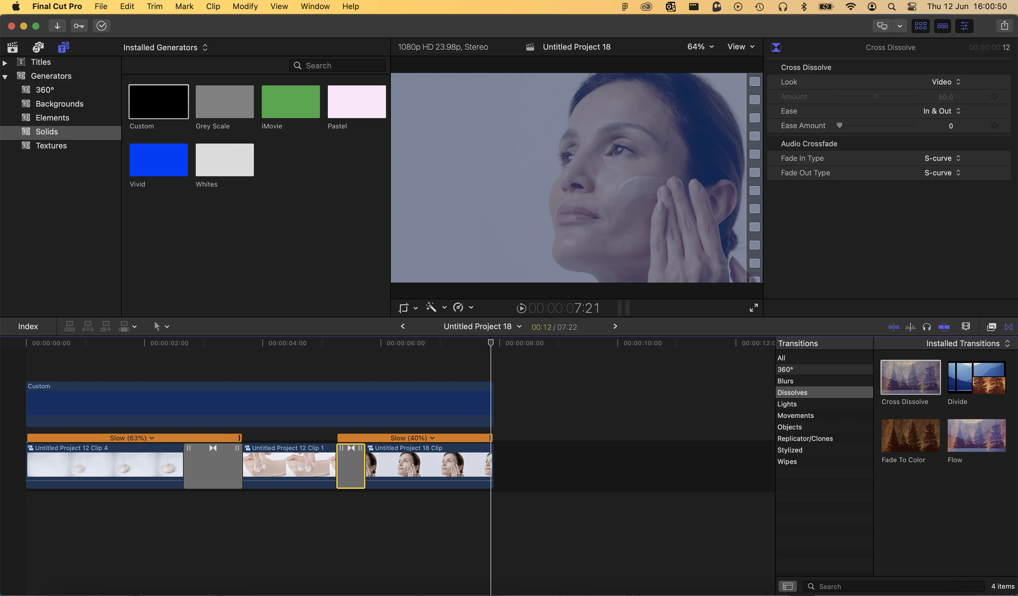
I wanted the user to be able to see the product’s texture and usage through video. We had a selection to choose from, so I edited them together, put a subtle blue tint over the video and slowed it down. This helped to create a soft, classy, premium feel to the hero banner. I left-aligned the text and utilised the Editor Pro font, as this was not used on their previous site, and was a staple part of their brand. The hero is the first thing a user sees when they go onto a website, and I wanted it to make a strong impression.
Product Cards Carousel
Based on data and research from our work on Colorescience, we found that users responded well to horizontally scrolling product carousels. I carried that learning across to HydroPeptide, using a partially visible next product to encourage interaction and make it clear there was more to explore.
The carousel also gave us more room to surface products horizontally without adding unnecessary vertical length to the page. I designed it as a reusable component that could be used for new arrivals, best sellers, collections and other product groups, keeping the experience consistent while giving the ecommerce team more flexibility with merchandising.
Hot Spots, Quick View and Easy Add to Cart
I introduced quicker ways for customers to interact with products directly from key areas of the site. Interactive hotspots and Quick View allowed users to explore product information without immediately leaving the page, while streamlined Add to Cart actions reduced friction for customers who already knew what they wanted.
These patterns were designed to make product discovery feel faster and more fluid, particularly across campaign content and product-led sections.
Information Motion Sections
I created a series of reusable motion sections to bring more of HydroPeptide’s science, expertise and brand story into the wider experience. I edited the footage in Final Cut, adding a subtle blue treatment and slowing each clip down to create seamless loops that showcase the texture and movement of the products while adding to the premium feel of the site.
The sections were designed to work across the homepage and throughout the wider site, allowing content around peptide science, clinical expertise and brand storytelling to be introduced wherever it was relevant, while keeping the experience visually consistent.
Product Pages Built to Scale
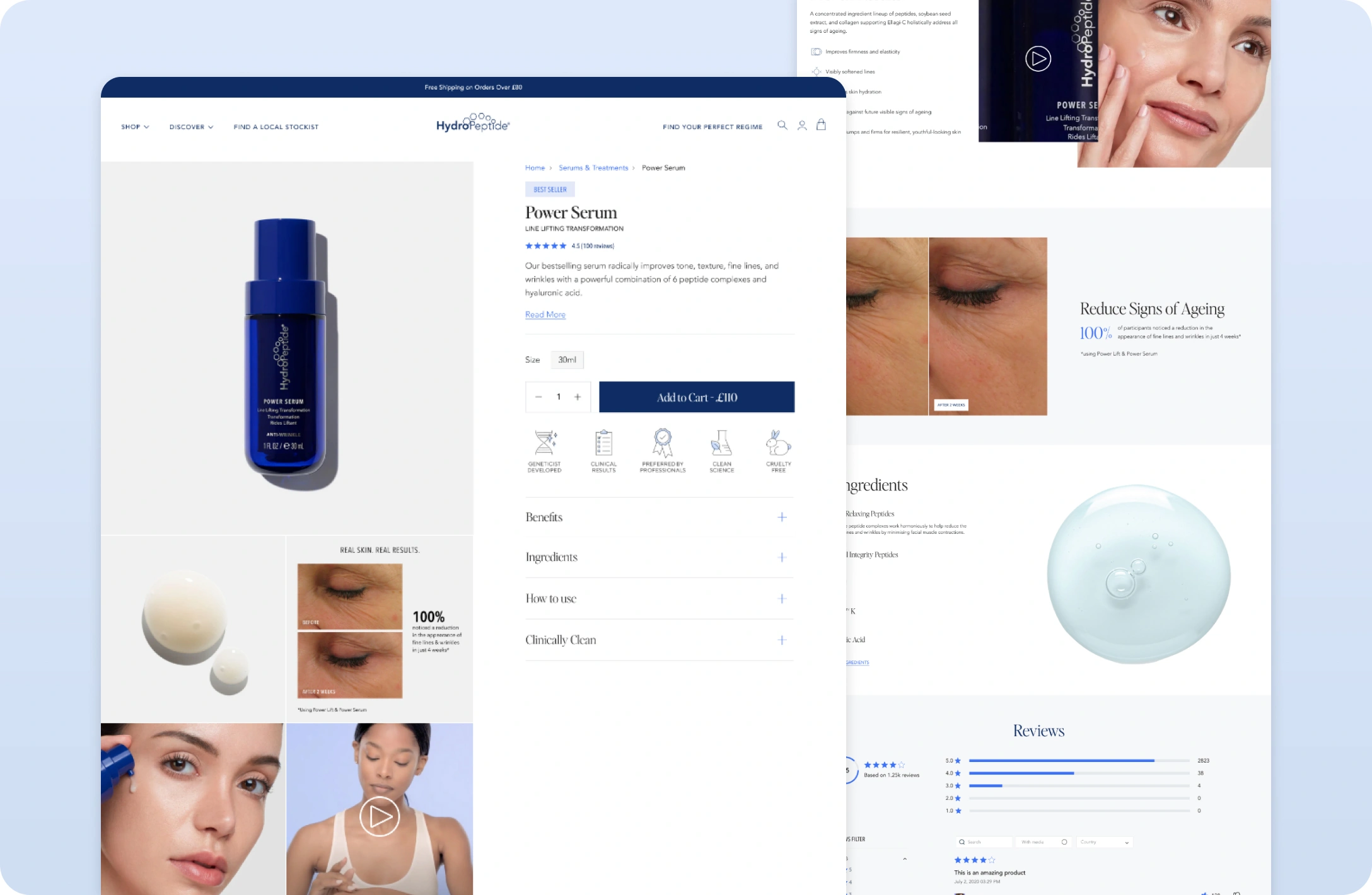
I redesigned the product page to make the key information easier to scan while giving the product imagery more space to do the selling. Larger product and lifestyle images sit alongside the main product information, with the content scrolling alongside them so pricing, benefits and purchase actions remain easy to access.
Below the main PDP, I introduced a series of reusable content sections for things like proven results, before-and-after imagery, key ingredients, clinical claims, reviews, complementary products and campaign content. These sections could be mixed and matched depending on the product, allowing each page to tell a more relevant story without needing a completely bespoke layout.
Together, this created a more consistent and scalable product-page system across the HydroPeptide range, while still giving individual products enough flexibility to highlight what made them unique.
Expanding the Experience
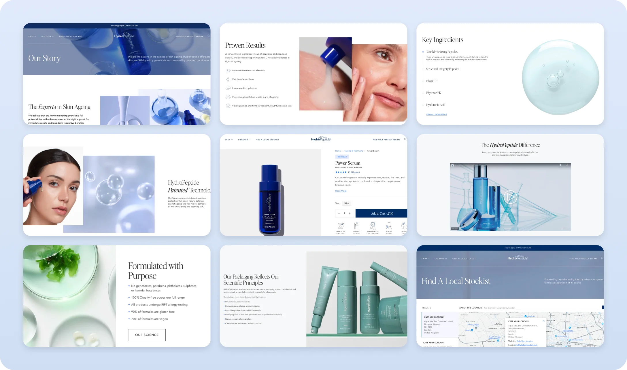
The redesign went beyond the main shopping journey, with updates across a number of supporting pages and content areas. I created reusable sections for things like HydroPeptide’s story, clinical results, ingredients, patented technology and sustainability, as well as functional pages such as the stockist finder. I designed with the thought in mind of making these sections modular to help make the experience feel more consistent across the site, while also making it quicker and easier to build out new pages and campaigns in the future.
Connecting the Dots
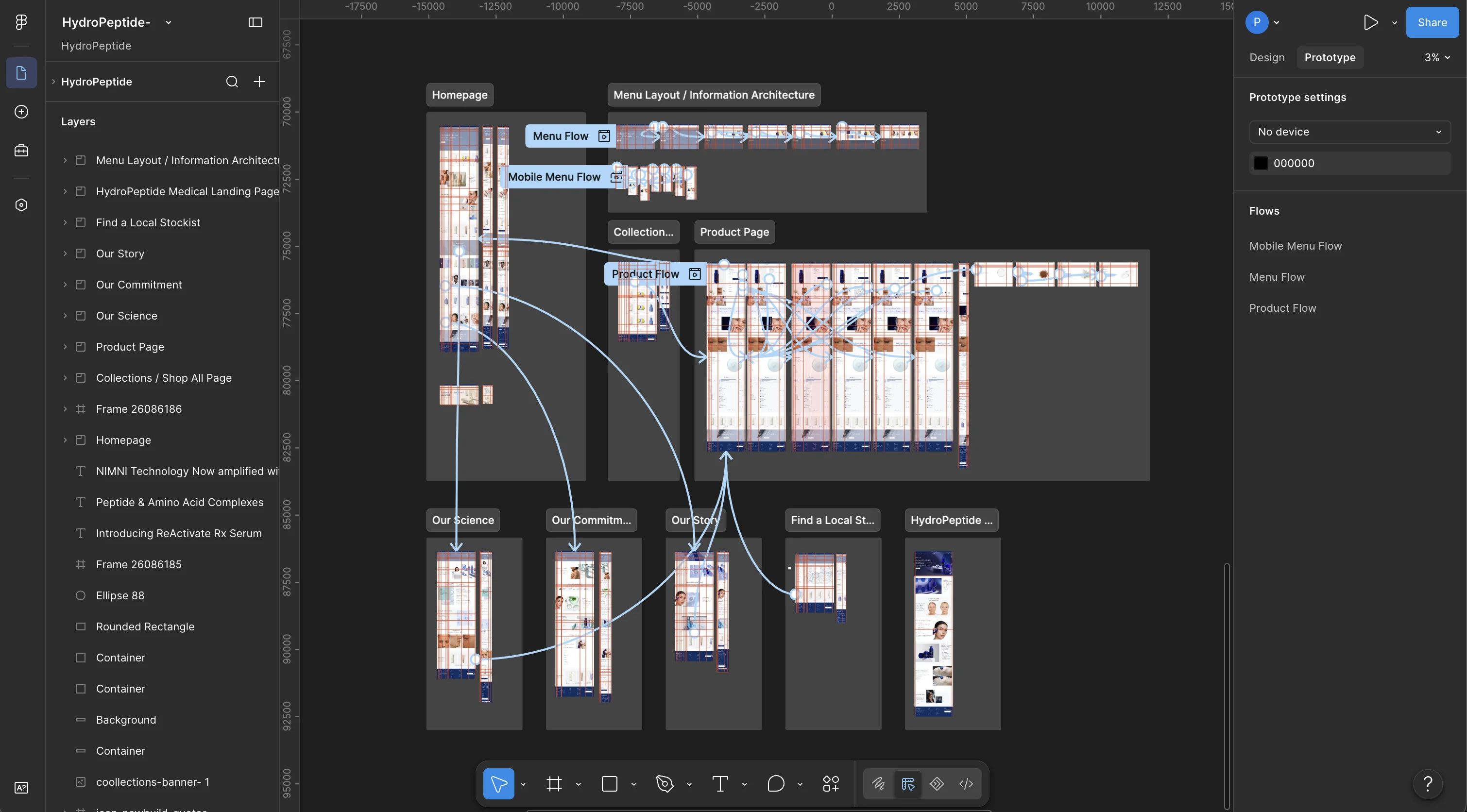
I connected the key journeys in Figma to see how the experience worked as a whole, linking everything from navigation and product discovery through to PDPs, brand content and the stockist finder. This helped me refine the flow between pages and make sure the wider experience felt connected rather than designed as a collection of individual screens.
Designed for Every Screen
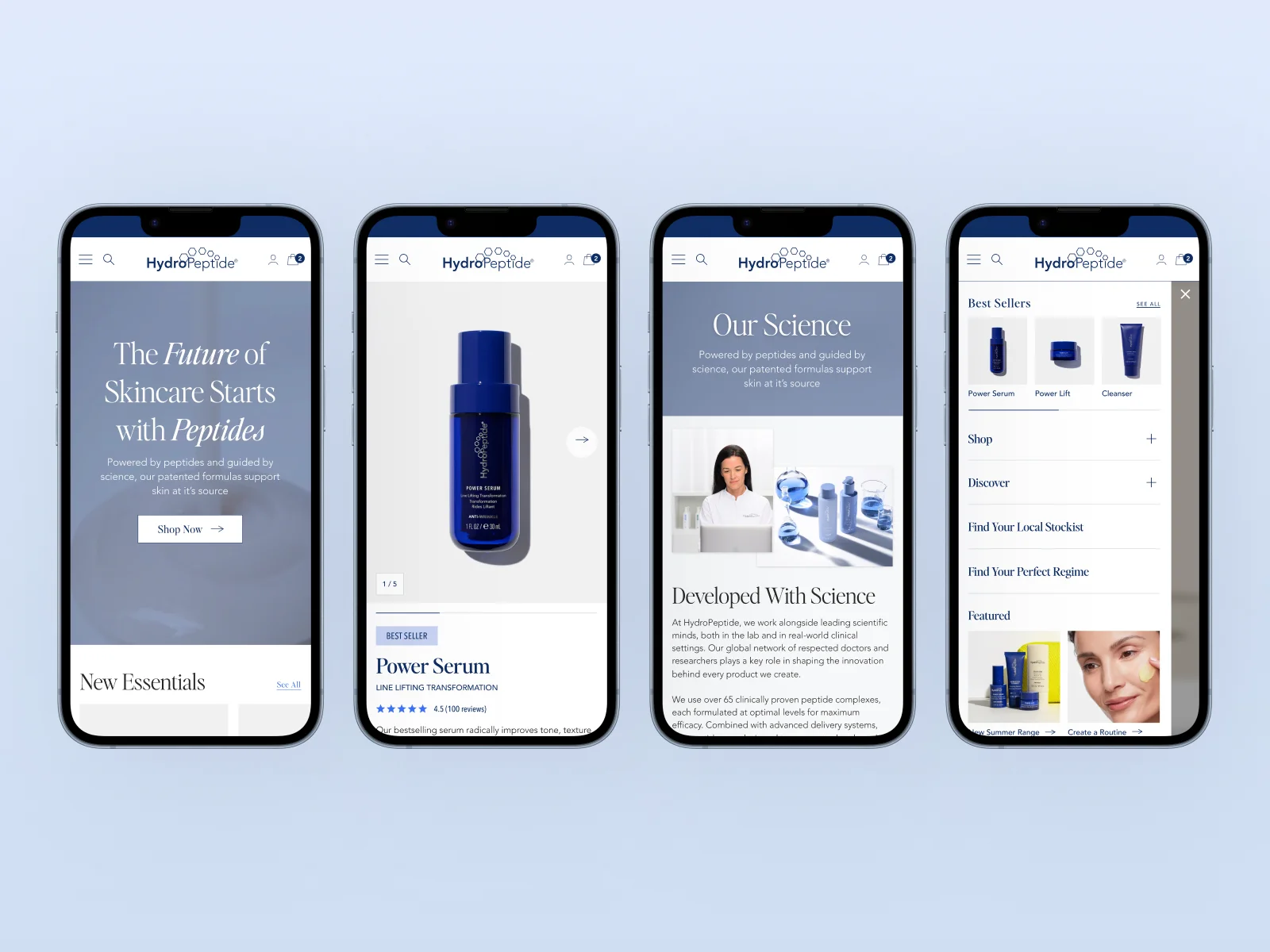
The experience was designed with responsiveness in mind from the start, I made sure the same level of detail and usability carried across desktop, tablet and mobile. I adapted the navigation, pages and interactions to work naturally at each breakpoint, so the user would be able to easily navigate the website and make purchases no matter what device they were on.
The Results
The redesign created a much clearer, more consistent experience across HydroPeptide’s UK website, improving how customers discovered products, understood the brand and moved through the wider shopping journey.
By restructuring navigation, improving product pages, introducing reusable content sections and designing the experience responsively from the start, I was able to create a more scalable ecommerce system rather than a collection of individual pages.
The new experience also gave the ecommerce team greater flexibility to launch campaigns, update content and build new pages using a consistent set of reusable components.
Conversion Uplift
+12%
Clearer navigation, stronger product discovery and a more focused path to purchase.
Add to Cart Increase
+18%
Improved PDP hierarchy, larger imagery, Quick View, Hot Spots and more key information.
Mobile Conversion Uplift
+15%
Improved navigation, content hierarchy and product interactions specifically for smaller screens.