
Wigmore Medical
Redesigning a complex medical ecommerce platform to improve usability, product discovery and conversion for aesthetic professionals.
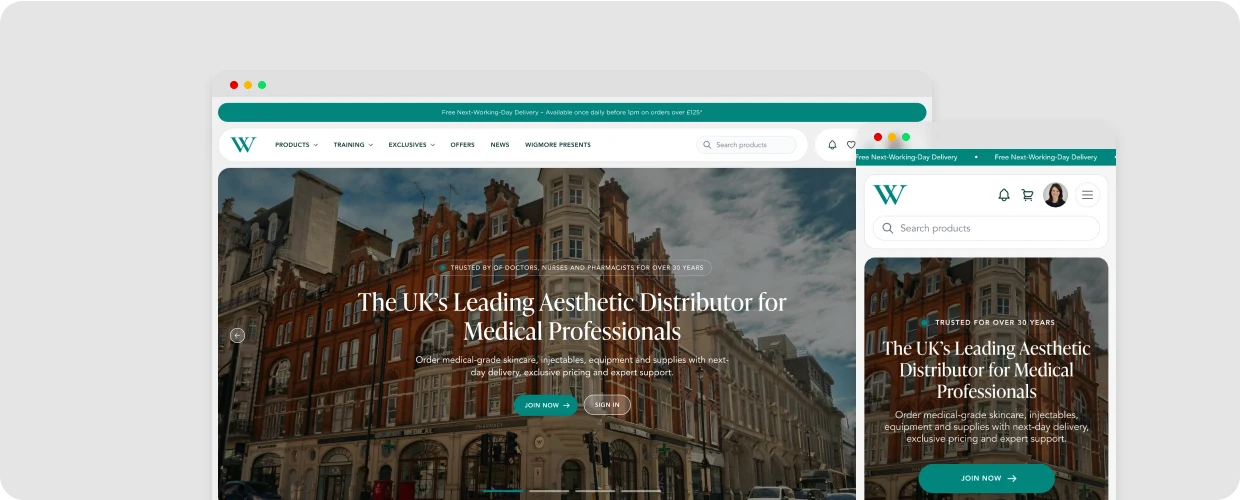
Website
View the Website
Wigmore Medical is the longest established aesthetics distribution company in the UK, with over 30 years of industry experience.
Background
Wigmore Medical’s platform had evolved into a complex digital ecosystem designed specifically for healthcare professionals and their teams to purchase and prescribe medical products. Unlike a traditional e-commerce experience, the website needed to support different user roles, purchasing permissions and clinical workflows, while ensuring every user had access to the correct products, pricing and permissions.
The Problem
Over the years, Wigmore’s website had scaled in size, as did it’s users, inventory and capabilities. Purchasing flows became complex, user roles and permissions became confusing and the website’s appearance became outdated. As a result of this, customers became frustrated and dropped-off. Wigmore’s platform needed a full revamp from modernising it’s identity to untangling it’s complex purchasing flows and making it easy as possible for healthcare professionals and their team to use.

Modernising the Brand Identity without Losing Recognition
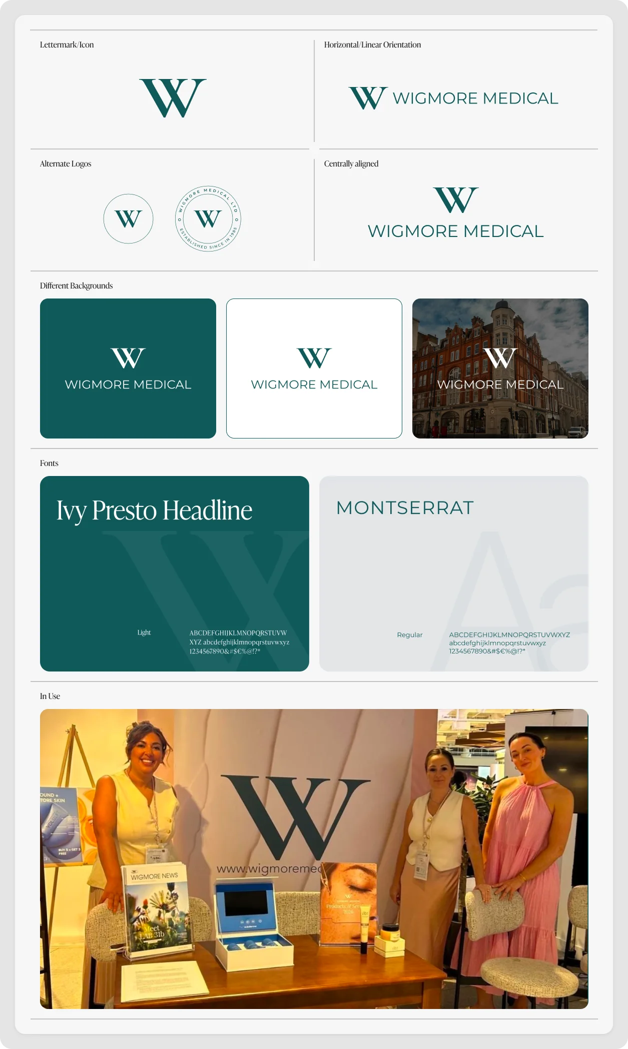
Firstly, Wigmore's established identity had credibility and recognition, but its visual expression no longer matched the scale, authority or quality of the business. The company’s brand needed a more refined digital presence without discarding the familiarity it had built over time. I approached the work as an evolution rather than a reinvention.
After conversations with the stakeholders, it was clear that the aim was to preserve what made Wigmore Medical recognisable whilst improving balance, distinctiveness and flexibility across the brand. The stakeholders understandably wanted to keep their already renowned ‘W’ monogram and not to stray too far away from their established colours, so I took this feedback onboard and got to work.
The previous logo’s, ‘W’ monogram was bold with a slab-serif font and the Wigmore Medical font was a mixture of filled and outlined text within an oval. It felt dated and more digital than medical. My answer was to give their logo a more richer and premium feel with a serif ‘W’ monogram to reflect their status and a sleek clear sans-serif font as a nod to it’s modernism in the medical world.


Understanding the Existing Access Model and System
Having worked in Wigmore for a number of years, I grew to understand the structure of the website, I learnt about RX pricing, prescriptions, clinics, professions that were capable of prescribing RX products to patients, etc. but the website’s architecture was never laid out on paper to see clearly how the website functioned.
Before redesigning the experience, I needed to lay out the basics of Wigmore. The existing access model and by having it laid out figure a way to simplify the experience because organically over time roles and professions seemed to have overlapped over time. The access to products and functionality wasn’t determined by a single user type, but by a combination of professional qualification, system role and account status.
I mapped the different professions and roles alongside the actions they controlled, which helped expose where responsibilities overlapped and where similar users could experience very different journeys. This gave me a clearer picture of the rules behind prescribing, purchasing, approvals and account access before making any changes to the experience.
Old Access Model (Overlapping Professions, Roles and Status)
As you can see below, there were overlapping roles. The account status’ were mixed in to the User’s role and the term Prescriber was used frequently in both instances. This needed to be simplified to avoid confusion and make it easier to understand, manage and extend.
Profession
The Profession determines their role and if a registration number is required.
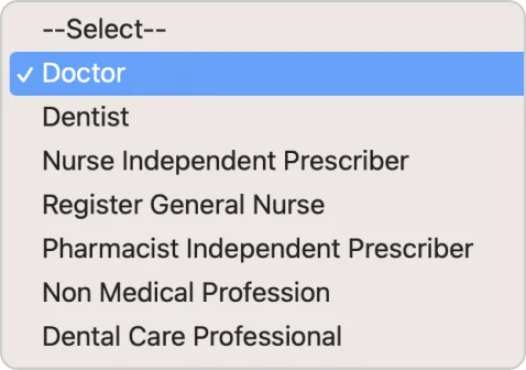
User Role
This controls what the person could actually do within Wigmore
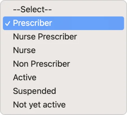
New Access Model (Separated and Structured)
I separated the professions to clearly indicate Prescribers and non-prescribers. The User Roles are simplified to general roles and account status has been moved to it’s on level to avoid confusion and overlap. This way makes everything easier to manage and understand, plus allows growth in the future for more professions, etc.
Profession
Professions now clearly states whether they are prescribers or non.
User Role
Clearer User Roles separated from Account Status
Account Status
Clear account status’
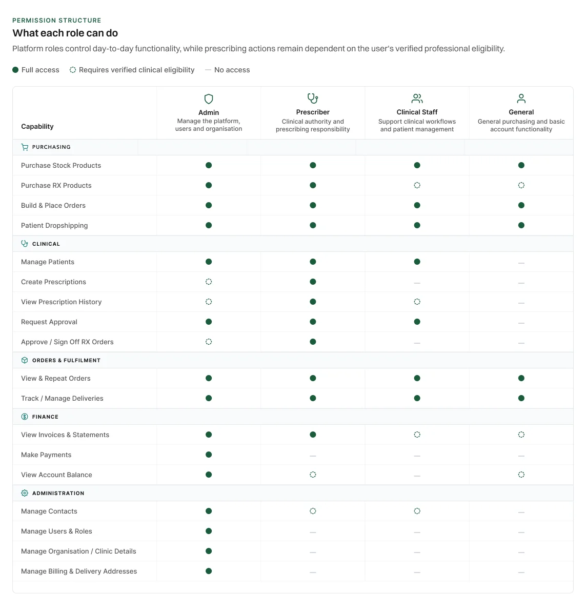
Permissions Matrix
Once I had organised and simplified the relationship between professions, user roles and account status, I created a permissions matrix to clearly define what each role could access and do within the platform. This helped remove ambiguity, highlight where clinical verification was required and gave the team a single reference point for designing and developing each user experience.
Redesigning the End-to-End Experience
With the wider platform structure and permissions mapped out, I documented and refined more than 20 user flows across purchasing, prescribing, patient management, approvals, account management and fulfilment.
Rather than showing every journey in detail, the three examples below focus on some of the most complex and representative flows. Together, they show how I simplified clinical decision-making, reduced unnecessary backtracking and created clearer paths through the platform while still respecting the permissions and business rules behind each task.
Key User Flows
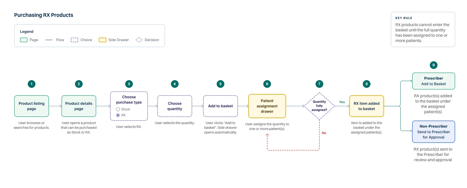
Ordering RX Products Flow
I mapped the Ordering RX Products user flow to define the clearest route from product discovery through to patient assignment and purchase. Because some products could be purchased as either RX or Stock, the flow needed to make that choice clear while adapting the next action to the user’s permissions.
When RX is selected, the user chooses a quantity and assigns the full amount to one or more patients before continuing. This prevents incomplete prescription items from progressing further into the order. From there, a Prescriber can add the RX product directly to their basket, while an eligible non-prescriber can send it to a Prescriber for approval.
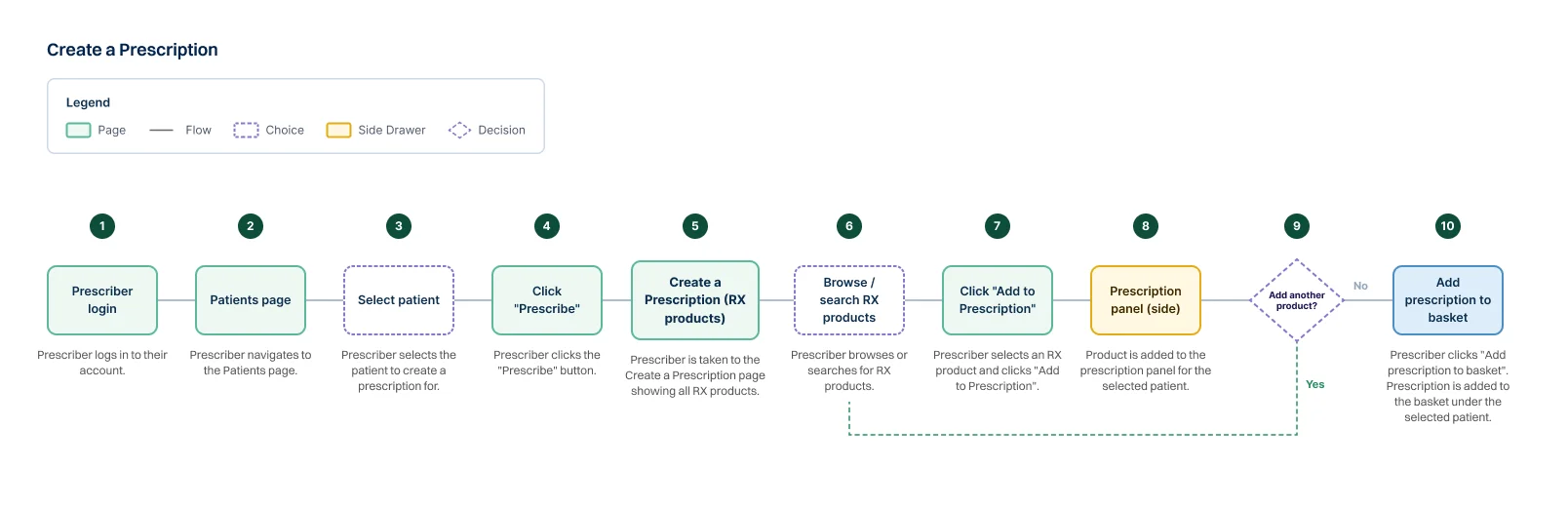
Create a Prescription
As an alternative to starting from a product, I mapped a patient-first prescribing route for Prescribers who already know who they are creating a prescription for.
The journey begins in the Patients area, where the Prescriber selects a patient and enters a dedicated Create a Prescription page containing only RX products. Products are added using an Add to Prescription action, while a persistent prescription panel keeps the selected patient and added items visible throughout the process.
This gives Prescribers two clear ways to work, either start with the product and assign it to a patient, or start with the patient and build a complete prescription around them. Once finished, the prescription can be added to the basket in a single action.
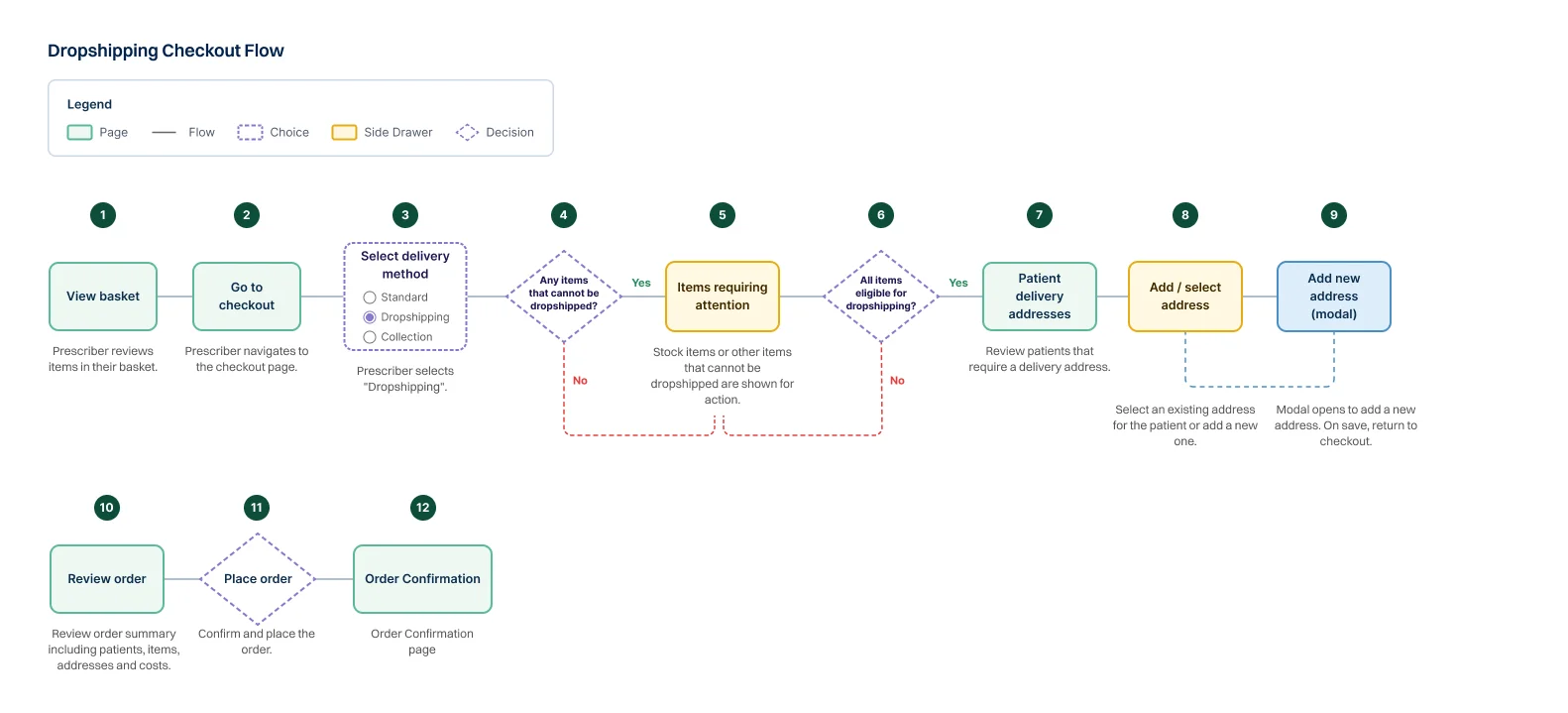
Dropshipping Flow
Dropshipping was one of the most fragmented journeys in the original platform. Previously, a user could reach checkout, select Dropshipping, then be sent backwards to the basket to assign RX products to patients or remove items that could not be dropshipped. This interrupted the checkout flow and forced users to fix problems in a completely different part of the journey.
I redesigned the experience so the important setup happens earlier. RX products are already assigned to patients during the purchasing or prescription flow, meaning checkout can focus purely on fulfilment. When Dropshipping is selected, the system immediately identifies any incompatible items, such as Stock products, and surfaces them as Items Requiring Attention directly within checkout.
Once those issues are resolved, the user can review each patient’s delivery details, select an existing address or create a new one through a modal, then continue through postage, payment and final order review without leaving checkout. The result is a much more linear journey that preserves context, reduces backtracking and helps prevent fulfilment errors before the order is placed.
Designing the Details That Drive Purchase
With the core journeys mapped, I moved into the interface itself, focusing first on the smaller interaction details that could have the biggest impact on usability and purchasing behaviour. One of the first areas I reshaped was the product card, a critical point where users decide not only what they want to buy, but how they will purchase the product.
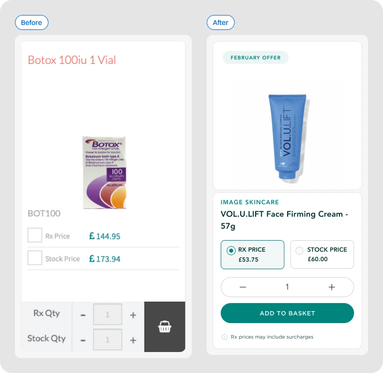
The original card treated RX and Stock with 2 separate quantity controls, this created an unfamiliar interaction pattern and asked users to manage 2 purchase routes at once. Applying Jakob’s Law, I simplified this into a more familiar e-commerce pattern, users select either RX or Stock, choose a single quantity and then continue through their chosen journey.
I also used Progressive Disclosure to reveal complexity only when it was needed. The stock product option follow the standard Add to Basket flow. The RX product option follows the patient-assignment step through a side drawer. This also supports Error Prevention, because RX products cannot enter the basket until they’ve correctly been assigned to a patient.
Alongside the interaction changes, I improved the Visual Hierarchy of the card, giving clearer emphasis to the product image, brand, name, pricing, selected state and primary CTA, whilst tightening the spacing and alignment across the component.
The result was a cleaner, more familiar purchase experience that reduced unnecessary choices, made the next action immediately clear and turned the product card into a stronger point of conversion.
Establishing the Visual Direction
With the purchasing experience beginning to take shape at component level, the next step was establishing a visual direction that could scale across the wider platform.
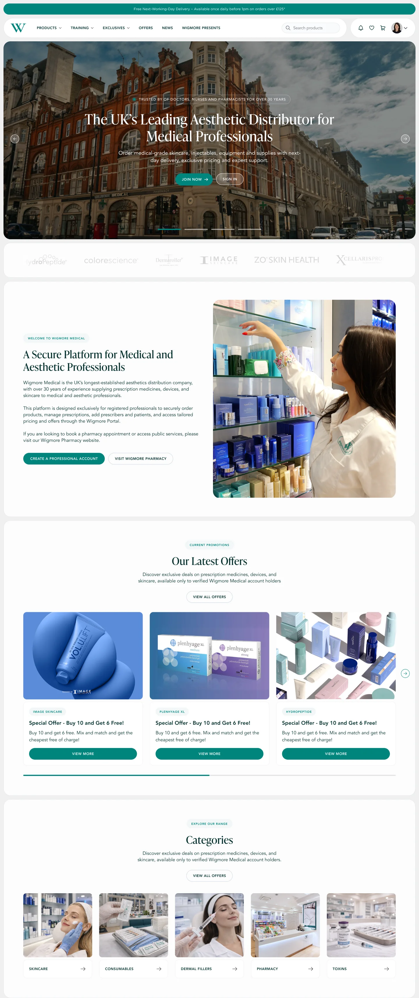
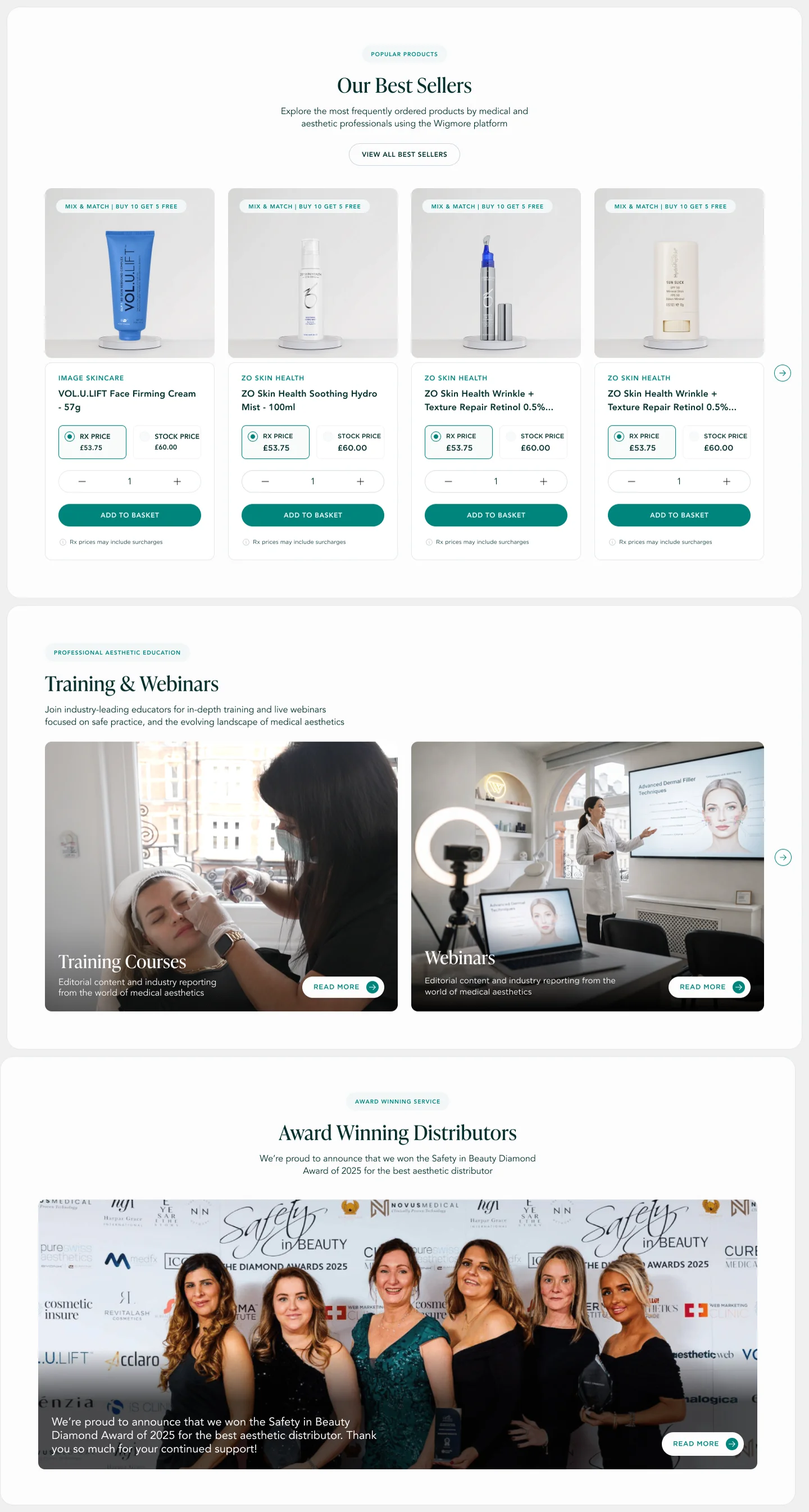
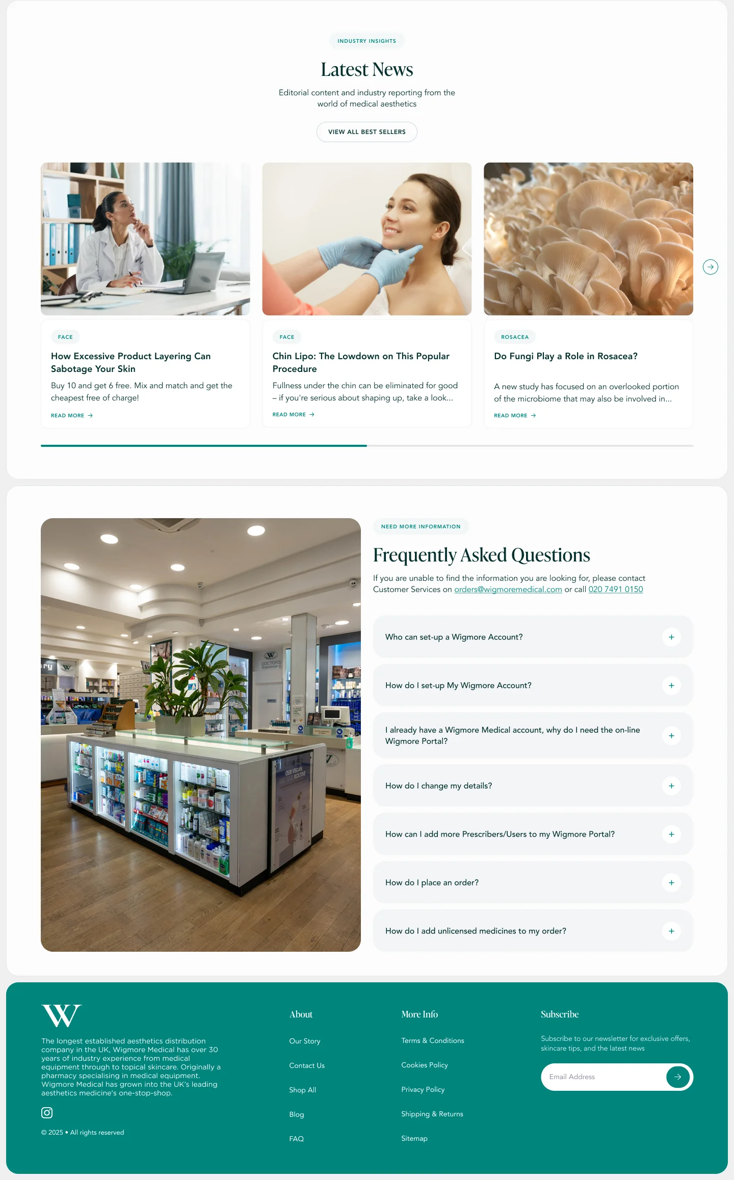
I used the homepage as the first major design benchmark, bringing together the new typography, spacing, imagery, hierarchy and component styles in a high-fidelity design that stakeholders could review as a complete experience. Their feedback helped refine the direction until we had a shared look and feel that could become the foundation for the rest of the product.
Rather than redesigning each page independently, I translated that direction into a more systematic approach, creating reusable components, consistent interaction states and shared patterns for elements such as navigation, product cards, buttons, forms and content layouts. Where appropriate, these were supported by shared styles and variables to keep spacing, typography and UI behaviour consistent.
Once that foundation was established, I could apply the same visual and interaction principles across the platform, making the experience more predictable for users while also creating a system that was easier to maintain, iterate and build upon.

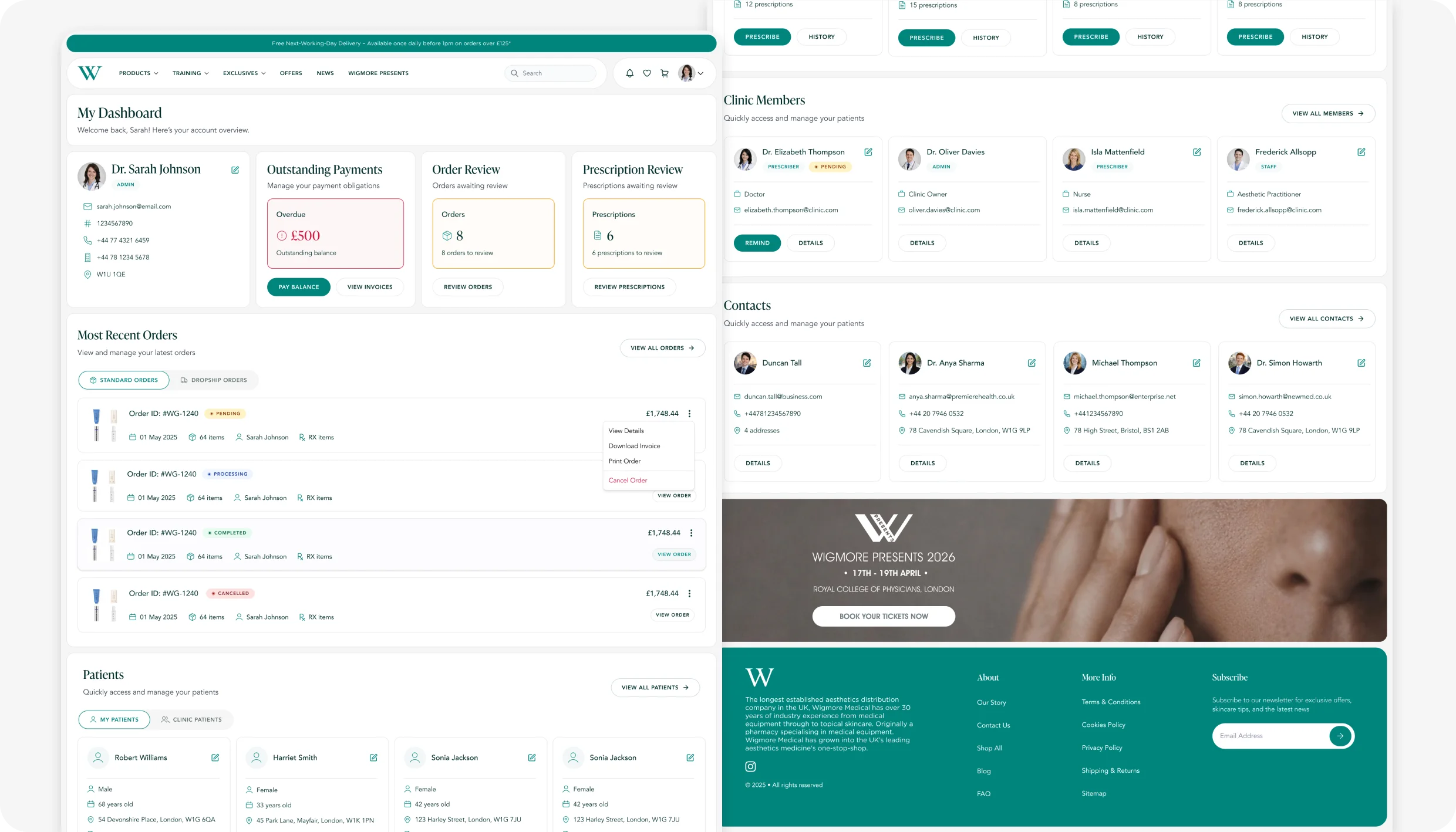
Designing the Dashboard as the Platform Hub
Once the visual system was established, the dashboard became one of the most important areas to redesign. It acts as the central hub for the Wigmore platform, bringing together the information and actions each user needs when they log in.
Rather than treating it as a generic landing page, I designed the dashboard around role and context, surfacing relevant account information, orders, patients, prescriptions, approvals and operational tasks in one place. This gave users a clearer starting point and reduced the need to navigate through multiple areas of the platform to understand what required their attention.
The same component and hierarchy principles established across the wider design system were applied here, creating a dashboard that could accommodate different permissions and responsibilities while remaining consistent and easy to scan.
From Flow to Experience
With the key journeys defined and the visual system established, the next step was bringing those decisions together through interaction. Across the redesign, I mapped and refined more than 20 user flows, covering everything from purchasing and prescribing to account management, approvals and fulfilment.
Rather than showing every journey in detail, the examples below focus on three of the more complex workflows, demonstrating how the underlying logic, permissions and design system came together in the final experience.
Ordering an RX Product as a Prescriber
Creating a Prescription as a Prescriber
Dropshipping as a Prescriber
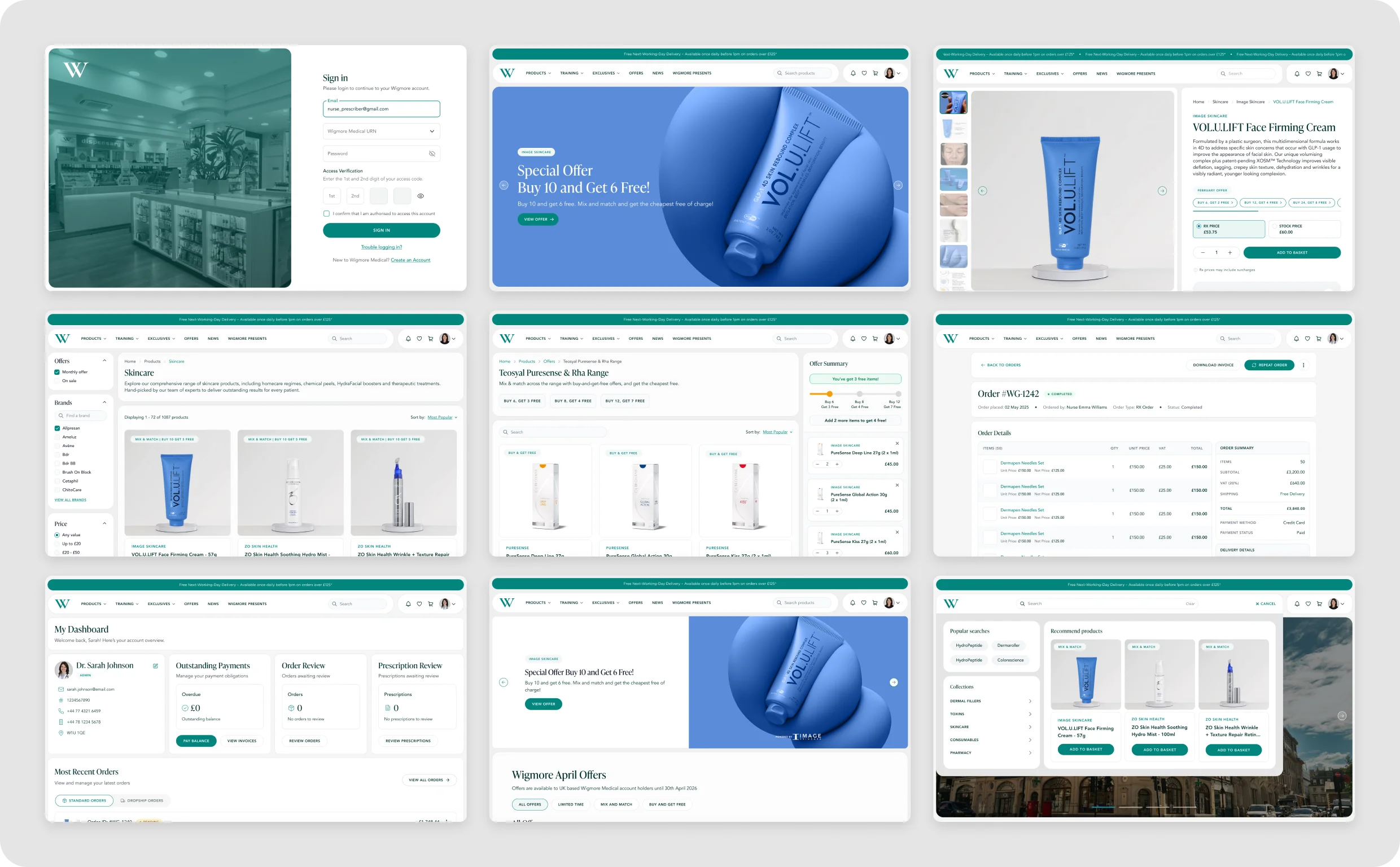
Scaling the System Across the Platform
Once the visual direction and core interaction patterns were established, I applied the same system across the wider Wigmore platform. Product listings, product pages, patient management, account areas, ordering and clinical workflows were redesigned using shared components, spacing, typography and interaction patterns.
Rather than treating each page as an isolated design problem, the goal was to create a platform that felt consistent and predictable wherever the user entered the experience. This also made the system easier to extend, giving future features and workflows an established foundation to build from.
Designing Across Every Screen
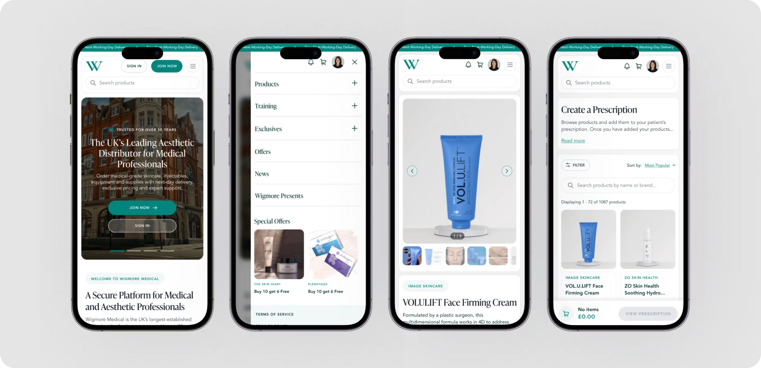
The platform also needed to remain usable across smaller screens, despite the amount of information and functionality available to professional users. I adapted layouts, navigation, tables, product interactions and complex workflows for mobile rather than simply scaling the desktop interface down.
Components were designed to reflow and prioritise the most important actions, maintaining the same hierarchy and interaction patterns across devices while reducing unnecessary visual complexity.
The Outcome
The redesigned platform launched shortly after the end of my contract with Wigmore, so I did not have access to enough post-launch data to responsibly attribute quantitative improvements to the redesign.
The qualitative improvement, however, was significant. A fragmented interface with overlapping roles, inconsistent purchasing patterns and workflows that regularly sent users backwards was replaced with a clearer, more cohesive system. Roles and account states were separated, RX and Stock purchasing became easier to understand, clinical workflows became more structured, dropshipping could progress without unnecessary backtracking, and a shared design system brought consistency across the wider platform.
Most importantly, the redesign created a stronger foundation for Wigmore to continue evolving the platform without recreating the same complexity that had accumulated over time.